StayEase
A Calm and Clear Hotel
Booking Experience
Role: Visual Designer
Project Type: Personal Case Study
Platform: PC
Overview
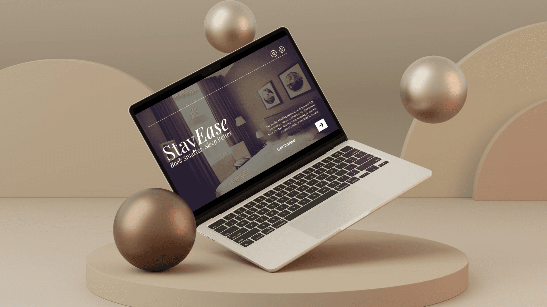
StayEase is a fictional hotel booking platform designed to simplify the travel planning process with a focus on ease, trust, and comfort. This case study explores the brand’s identity, audience, and tone, as well as the visual strategy behind the UI and marketing assets.
Brand Identity
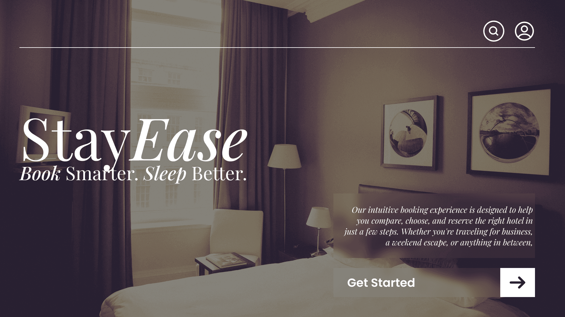
StayEase is built around the idea that booking a place to stay should feel as relaxing as the trip itself. The brand communicates simplicity, lightness, and clarity in both function and style. The user experience focuses on helping travelers avoid the stress often associated with crowded booking websites.
Core Values: Clarity, comfort, simplicity, trust
Design Pillars: Minimal interface, clean typography, soft visuals,
intuitive interaction.
Target Audiance
StayEase is for modern travelers who value ease and reliability. These users don’t want endless filters or pop-ups—they want a clean, mobile-friendly experience that helps them find and book a room quickly.
Demographic: Age 25–45, solo travelers, working professionals, couples
Behavior: Books online or on mobile, values trust signals like reviews and transparency, prefers smooth design over flashy features
Tone & Voice
The StayEase tone is relaxed, clear, and helpful. Messaging avoids marketing fluff and focuses on making the user feel confident and at ease while booking.
Voice Traits: Friendly, efficient, professional
Example Phrases: “Find your stay. No stress.” – “Clear prices. No surprises.” “Book in minutes. Sleep in comfort.”
Visual Direction
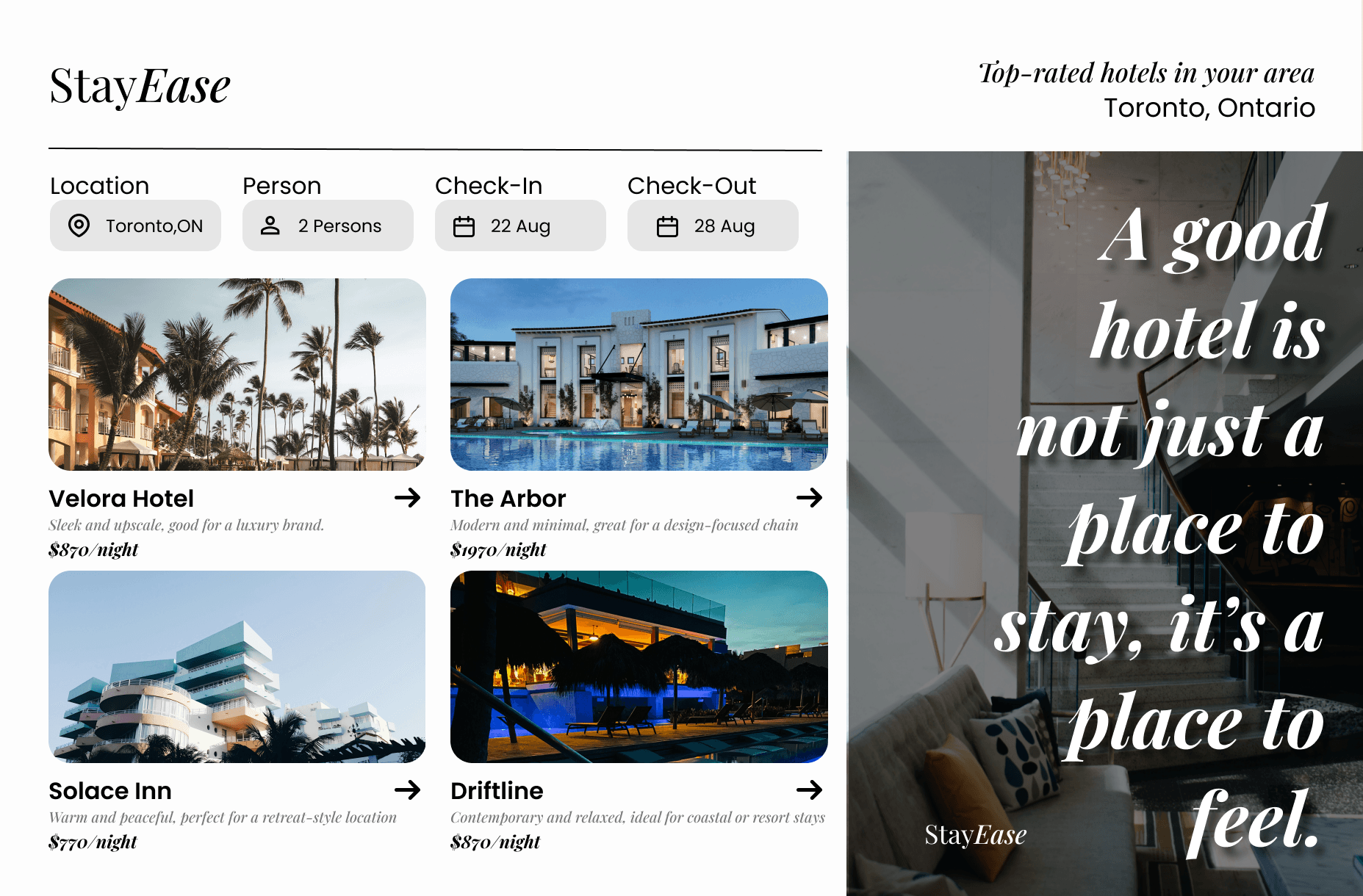
The visual style is light and calm. Inspired by modern UI trends, the design uses plenty of white space, rounded edges, neutral colors, and simple icons. The layout helps users stay focused on one task at a time, from search to checkout.
Color palette: Soft neutrals and warm grays
Typography: Sans-serif fonts for clarity and warmth
Imagery: Peaceful travel scenes, clean hotel interiors, human-centered visuals
Layout: Responsive grid with generous spacing, card-based sections
Design Assets
As part of this project, I created several supporting assets to complete the brand ecosystem.
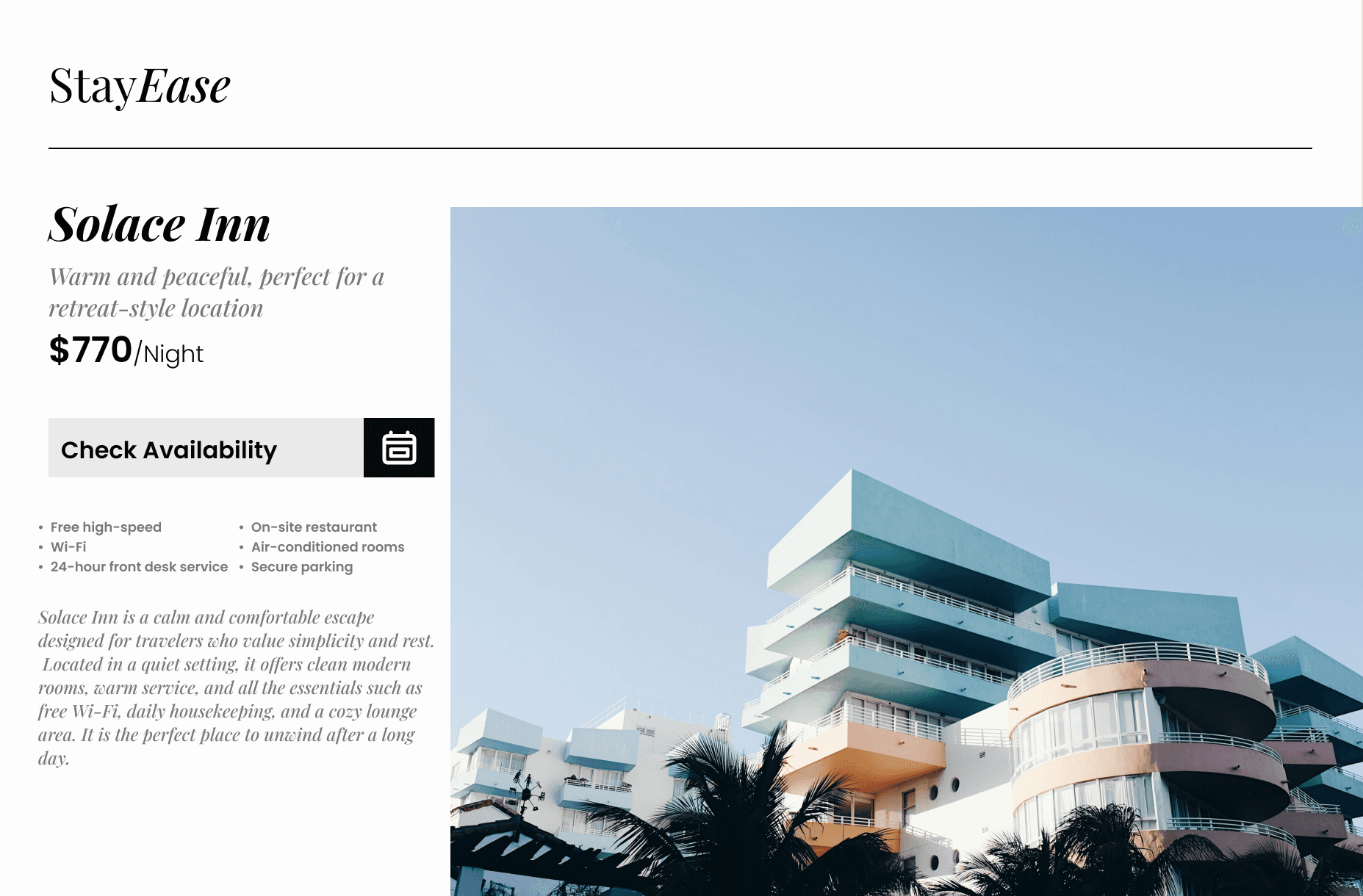
Three core UI pages: Home, Booking Results, Checkout
Mobile-friendly prototypes
Social media ad mockups promoting quick booking and special offers
Custom icons and UI components for hotel listings, filters, and navigation
Brand tagline: Hotels made simple. Travel made better.
Outcome
StayEase demonstrates how UX design can bring clarity to a typically overwhelming process. The clean UI, smart structure, and consistent visual language work together to help users feel in control of their booking.
This project helped me explore how design choices affect not just usability but also emotion and brand perception.